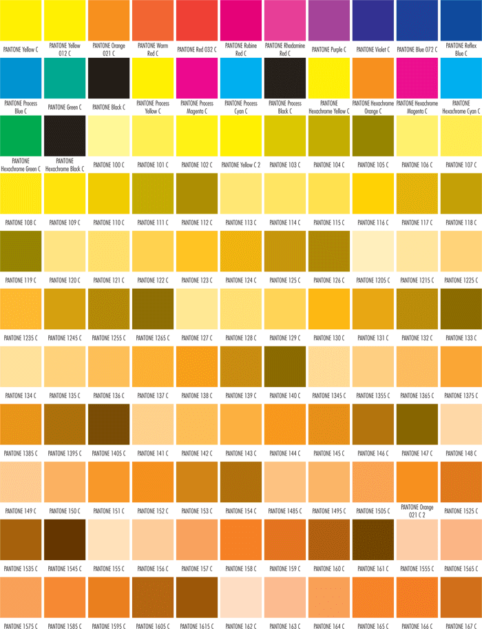
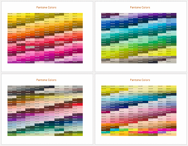
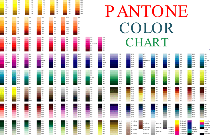
A pantone color chart shows a review of standard colors according to the Pantone color reproduction system. It is a mostly normalized color reproduction system. Many industries, usually printing, although sometimes in the manufacture of fabrics, plastics, and colored paint, use the color space.
Various people use the Pantone color guides; designers, printers, and clients in all industries for precise color identification, communication, and quality control. The Pantone color matching system inks become yellowish over time, so you should purchase the PMS color guides annually. The Pantone color matching system enables designers to color match various colors when a design enters the production phase. A color variance occurs based on the paper stock you use. A color variance will happen when changes to particular paper stock used have occurred.
You can use a Pantone Color Finder Tool for converting or identifying Pantone colors then find products that match online to buy.
Pantone Color Matching System
Different manufacturers in separate locations can turn to the Pantone system to ensure the colors match without direct contact. It is mostly a standardized color reproduction system.
One use of the Pantone color matching system is standardizing colors in the CMYK (Cyan Magenta Yellow Black). CMYK is a process of printing color using four inks. People use the CMYK process to print color using the four (Cyan Magenta Yellow Black) inks. CMYK can be used to produce a subset of unique Pantone colors. However, the CMYK process cannot simulate most of the colors (spot colors) in Pantone’s system. These colors are manufactured with 14 base pigments (including black) mixed in specified amounts. The production of many unique colors like fluorescents and metallic is also allowed by Pantone’s system.
Their given numbers describe Pantone colors; for example, PMS 120 is almost always used in branding. In producing flags, organizations such as the International Automobile Federation chose to refer to specific Pantone colors.
Pantone Goe system
Pantone Goe system is not there to replace the existing Pantone matching system. Instead, it will add a new dimension of spot color possibilities. The Panton Goe guide selects, specifies, and communicates well over 2000 new solid colors within the Pantone Goe system. Different combinations of the ten Pantone Goe mixing bases create the Goe system colors. For accurate reproduction and simulation, the brightly arranged colors are printed with their RGB (Red, Green, and Blue) colors and ink mixing formulas.
The Goe consists of a guide (Pantone Goe guide) and a CD with software that serves many applications that use a color palette. The guide contains seven colors and 294 leaves per page identified by each color determined by its ink mixing formula, RGB, and number. CMYK can only produce a color if four dots indicate it. The existing Pantone matching system colors (over 1000) are not being phased out as they are an integral part of many projects.
What is the Pantone Color System?
Through every step of the workflow for manufacturers and brands, Pantone provides a universal color language that enables vital color decisions. Many designers worldwide depend on Pantone products and services to help them communicate and control color from a dream to realization. In graphic arts, the Pantone color system’s heart is a paper printed with solid color ink because the solid colors represent the portrayal of color intent. Solid color printing is the process by which color is formulated and applied through the printing process.
There are two color systems;
- The pantone matching system (pms)
- The pantone fashion, home + interiors (fhi) system
Why two?
- Color is not an element that should be underestimated or overlooked as it can hugely impact your business’ branding. It plays a crucial role in keeping all your marketing materials consistent across the web, production, and print. Many companies’ failure to reach this consistency is brought about by their inability to understand how to use colors across different mediums. Each color system has its specific usage. You can get consistency for your products by understanding color systems.
- For establishing a strong message, knowing how to use the right color or color combination helps connect better with your target audience, leading to brand improvement. Picking colors can be a bit complex as they can look completely different across the print.
- Different people have different needs. For example, fashion designers need more whites, blacks, and neutrals in their art, while packaging and print designers prefer colors that will pop.
- Based on the material in which it is produced, the color’s appearance can change, while some colors are not attainable at all on a particular material. Having two systems helps ensure the colors included are obtainable based on the materials used. All our color libraries are backed by the scientific possibility to meet manufacturing needs. Our systems are available worldwide. For example, when a designer in Melbourne specifies a particular Pantone color number, the Tokyo manufacturer immediately knows which color they want and how to fulfill it even though they speak different languages; they both understand Pantone’s versatile colors.
Download Our Templates
A Pantone color chart will be most suitable for you if you are an artist, manufacturer, designer, or client. It is very detailed in terms of color recognition, quality control, etc. It is available in both excel and word formats, and you can refer by taking a print of it.
If you are associated with plastics and colored paint industries’ manufacturing, you should download and use one of these color chart templates to make your work easier and save on time.
A Pantone color chart template guarantees 100% color consistency. Using a Pantone color chart template ensures that you are working towards getting the perfect outcome. It is easy to download; choose the chart you want and download it on your system.


Frequently Asked Questions
A Pantone color chart shows a review of standard colors according to the Pantone color reproduction system.
To find the Pantone color using Adobe Illustrator;
ved “List” to clipboard.
First, open your logo Encapsulated PostScript (EPS) file in illustrator.
Select the colored area of the logo
Select window> color and swatches
Your Pantone reference id revealed by the color box; for example, Pantone 2354 (C= coated, U= uncoated)
The color box will show a CMYK breakdown if it does not give you a Pantone reference. Your innovative agency will help you reach the nearest match if you want a Pantone color.
You can also use a Pantone Color Finder Tool to identify colors and find products that match online to buy.
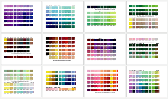
There are over 1000 Pantone colors that cover the entire orbit, each with a specific name. There is a particular sub-category of Pantone colors that can be reproduced by CMYK; however, most of the Pantone colors are not reproducible by CMYK.
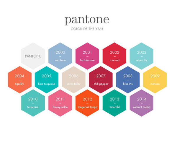
The Pantone color of the year is chosen by a printing company based in Carlstadt, determined from the Pantone color institute’s trend-forecasting research.
Each color is made up of one solid ink created by the printer using a particular formula. It provides the most flow when printing because the procedure is similar. These colors are called the Pantone Matching System (PMS).
The Pantone color of the year 2020 is Classic Blue, a shade similar to that of the sky at sunset.
The Pantone Fashion, Home, and Interiors material system are more costly than the pointed paper graphics system.
Using Pantone colors ensures your labeling color is consistent throughout as they are usually used for logo designs, while CMYK colors are suitable for color images such as photographs.
Conclusion
The Pantone color chart shows a review of standard colors according to the Pantone color reproduction system. Many industries use it, that is, printing industries, manufacture of plastics and colored paint. Various people use the Pantone color guide for specific tool verification, communication, and quality control.
You should purchase the Pantone color matching system annually as the Pantone color matching system’s ink becomes yellowish overtime. A color variance will happen when changes to particular paper stock used have occurred.
The Pantone Goe system adds new dimensions of spot color possibilities and not to replace the existing Pantone matching system. The Pantone Goe guide specifies and communicates over 2000 colors within the Pantone Goe system. The brightly arranged colors are printed with their (RGB), Red, Green, and Blue colors and ink mixing formulas. It is essential to know how to use colors across different mediums because it can hugely affect your business’ branding. Understanding how to use each color system brings about consistency. It also helps connect better to your target audience, leading to brand improvement. The color’s appearance can change based on the material on which it is used. Having two systems ensures the colors included are obtainable based on the colors used.